
In 1886, a pharmacist from Atlanta, Georgia, added coca leaves, kola nuts, and other flavourings to a kettle and sold the beverage for 5 cents a glass. It was an instant hit! But this is not the pharmacist’s story. Instead, this is the story of his bookkeeper.
While the pharmacist, John Pemberton, was experimenting with the ingredients and the flavouring, his bookkeeper, Frank Mason Robinson, was busy with something even more consequential. He was busy branding the drink.
First, he came up with a name for the drink. He picked two words from its main ingredients (coca leaves and kola nuts) and named the drink- Coca-Cola. His reasoning? Robinson thought that the two Cs would look good together. Most importantly, as a catchy alliteration, it would be easy for the public to recall.
Second, Robinson rolled up his sleeves and began working on its logo. As a skilled calligrapher, Robinson defaulted to a script logo in the Spencerian font. This font, a staple of the time, still lives on as the Coca-Cola logo.
Then came the time to make another momentous decision. Deciding Coca-Cola’s brand colours. The decision seemed so heavy that it did not come into effect till 1887- when the public became acquainted for the first time with the blazing red that we still know and love. At the time, Robertson chose the colours- red, white, and black to act as a stop sign, demanding the public’s attention. He chose bright red for its vibrancy and ability to stand out while evoking feelings of energy, passion, and refreshment. Unknowingly, Robertson applied colour psychology in his decision-making.
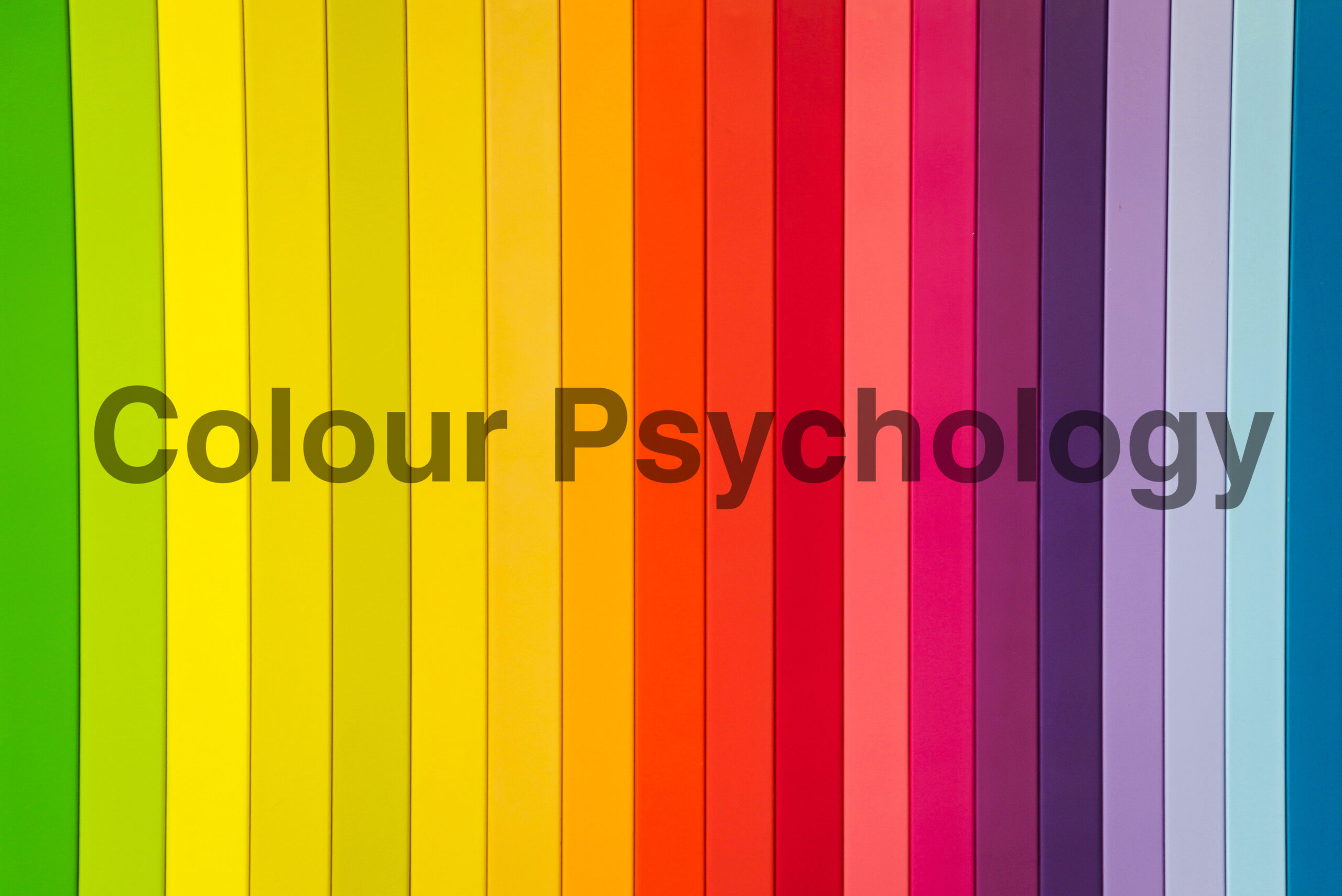
But what is colour psychology?
Colour psychology refers to the study of how colours influence human emotions, perceptions, and behaviours. The study explores how different colours can trigger specific psychological responses and associations in people.
Undoubtedly, colours are a remarkably visual tool. In fact, most people register colours before anything else, making colour psychology extremely important to branding.
If used thoughtfully, colour psychology has the transformative power to connect and communicate wordlessly. Whether you’re refreshing or building a brand, understanding colours can bridge the difference between forgettable and iconic.

Five reasons why colour psychology is essential in branding decisions.
Colours Have the Power to Create Emotional Connections.
The language of colours transcends words. They, almost instantly, evoke specific feelings and associations. For example, in colour psychology, Red, Yellow, Blue, and Green are considered primary colours. These colours represent the body, emotion, mind, and the harmony between these elements respectively.
- Red– With its extended wavelength, the colour is considered to represent strength and is associated with physical aptitude. It communicates passion, urgency, and excitement.
- Yellow– Colour psychology characterises yellow, with its considerably long wavelength, as a potent emotional stimulator. It communicates warmth, happiness, and optimism.
- Blue– Colour psychology views all shades of blue as a manifestation of human intellect. It instils trust and calm, making it a popular choice for finance, healthcare, and tech industries.
- Green– In colour psychology, green facilitates the harmony between the other colours and signifies nature, balance, and health.
Colours Have the Power to Define Brand Identity
Consistency is key to brand success. A consistent colour palette, therefore, is the cornerstone of a strong brand identity. For instance, the colour Ferrari Red is as synonymous with the brand as the luxury sports cars it manufactures. When used consistently across logos, websites, packaging, and advertising, colours establish recognition and trust. They eventually become visual triggers for the brand, helping consumers instantly recall their brand experience and perception.
Colours Have the Power to Influence Consumer Behaviour
Colour psychology can be adapted as a tool for guiding customer behaviour. By strategically placing colour in high-impact areas like Call to Action buttons, banners, and product highlights, designers can lead users toward desired actions and improve overall user experience. For example, e-commerce platforms often use red or orange “Buy Now” buttons to create urgency and boost conversions.
Colours Have the Power to Signal Market Positioning
Through colour, brands can communicate their values, target audience, and category without saying a word. For instance, businesses aiming to position themselves as luxury brands may use black, gold, or deep burgundy to evoke sophistication and exclusivity. On the other hand, toy companies tend to favour bright, playful and primary colours in their branding.
Colours Have the Power to Build Consistency Across Touchpoints
Maintaining visual consistency is key to brand success as it lends an air of professionalism and structural organisation to the brand. A well-defined colour palette ensures that your brand looks cohesive across touchpoints. From business cards to packaging and presentations, a consistent colour palette makes your business look put-together and thus, trustworthy.
Colour psychology, a theory when put into practice has the potential to transform into a powerful branding tool. It helps brands connect emotionally, guide behaviour, and stand out in a crowded market. Choosing the right colours isn’t just an aesthetic design decision, it’s a strategic one. After all, in branding, how you make people feel is just as important as what you say.
Choosing the right colours for your brand may seem like a tedious task, but not when you have a specialist branding agency like Dolphin Branding in your corner. Dolphin Branding has helped many businesses choose their brand colours by harnessing the power of colour psychology to tell your brand’s story without words. To work with us, drop us an email at: [email protected]
Comments are closed