Q Max
Brand Identity Development for Facility Management Services
Duration:
3 Months
Services:
Brand Identity
Marketing Collaterals
Location:
Pune
The Challenge
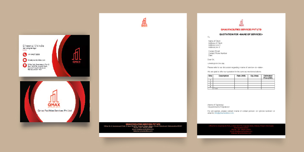
Q Max was launching its services in the B2B sector and required an established, sophisticated brand image to compete with national facility management providers.
Market Insights
In Pune’s corporate hub, facility management is seen as a high-stakes operational necessity. We tapped into the ‘Professionalism and Stability’ psychology. The ‘Aha!’ moment was realizing that the logo should directly hint at the commercial office buildings they maintain.
The Strategic Solution
The positioning is ‘Sophisticated Stability’. We used a dark theme with hints of red to represent an established, high-end company.
Design & Execution
The logo represents office buildings. We designed a premium stationery suite and a detailed services brochure with a dark, professional aesthetic.
The Results
Qualitative: Improved brand recognition among local corporate clients. Quantitative: The brochure served as a key lead conversion tool during initial B2B sales pitches.
Logo
Stationery