Launching “Zing” – A Snack for Sharing
A comprehensive concept study to look at the brand transformation for the FMCG, Potato Wafer Industry
Duration:
6 months
Services:
Branding
Packaging Design
Launch Campaign
Location:
Pune, India
The Challenge
Dolphin Branding conducted a concept study for the launch for a new accessible potato wafer brand targeting kids and young adults. The primary challenge was to create packaging that would ‘pop’ on the shelf while maintaining the colour schemes recognized by existing strong brands to ensure ‘cognitive continuation’ for consumers.
Market Insights
Our research highlighted the importance of balancing disruptive design with intuitive flavour recognition. In the competitive Pune FMCG landscape, consumer speed-to-shelf is critical. We identified that established brands use specific ‘base colours’ for flavours (e.g., Yellow for Salted), and deviating too far could confuse the buyer’s intent. The ‘Aha!’ moment was realizing that while the name and patterns could be modern, the flavour coding must remain familiar.
The Strategic Solution
We evaluated multiple names: ‘Crunch’ (direct), ‘Munch’ (approachable), and ‘Zing’. Ultimately, ‘Zing’ was selected because it implied high-energy flavour and excitement, perfectly matching the overall vibe of the brand. The positioning strategy focused on three pillars: Brand Promise (Logo), Product Clarity (Image), and Purchase Intent (Flavour).
Design & Execution
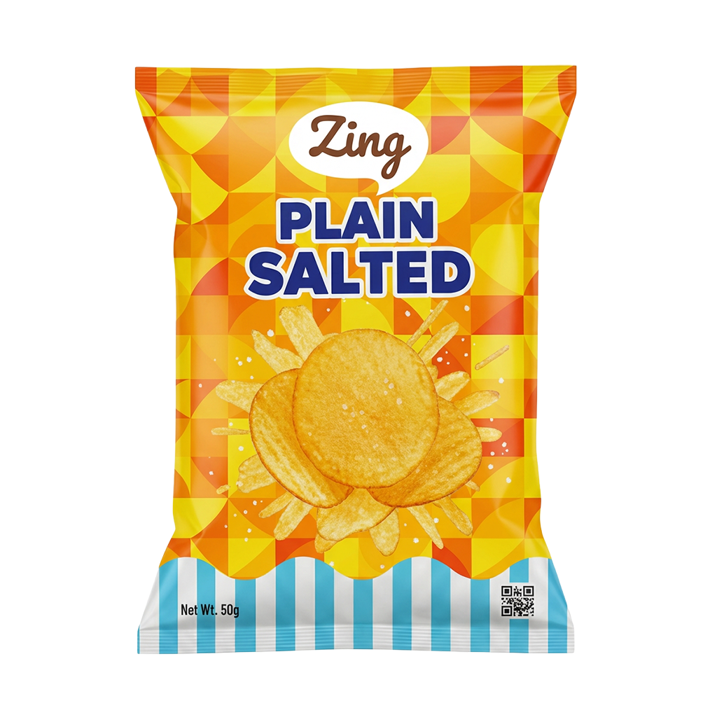
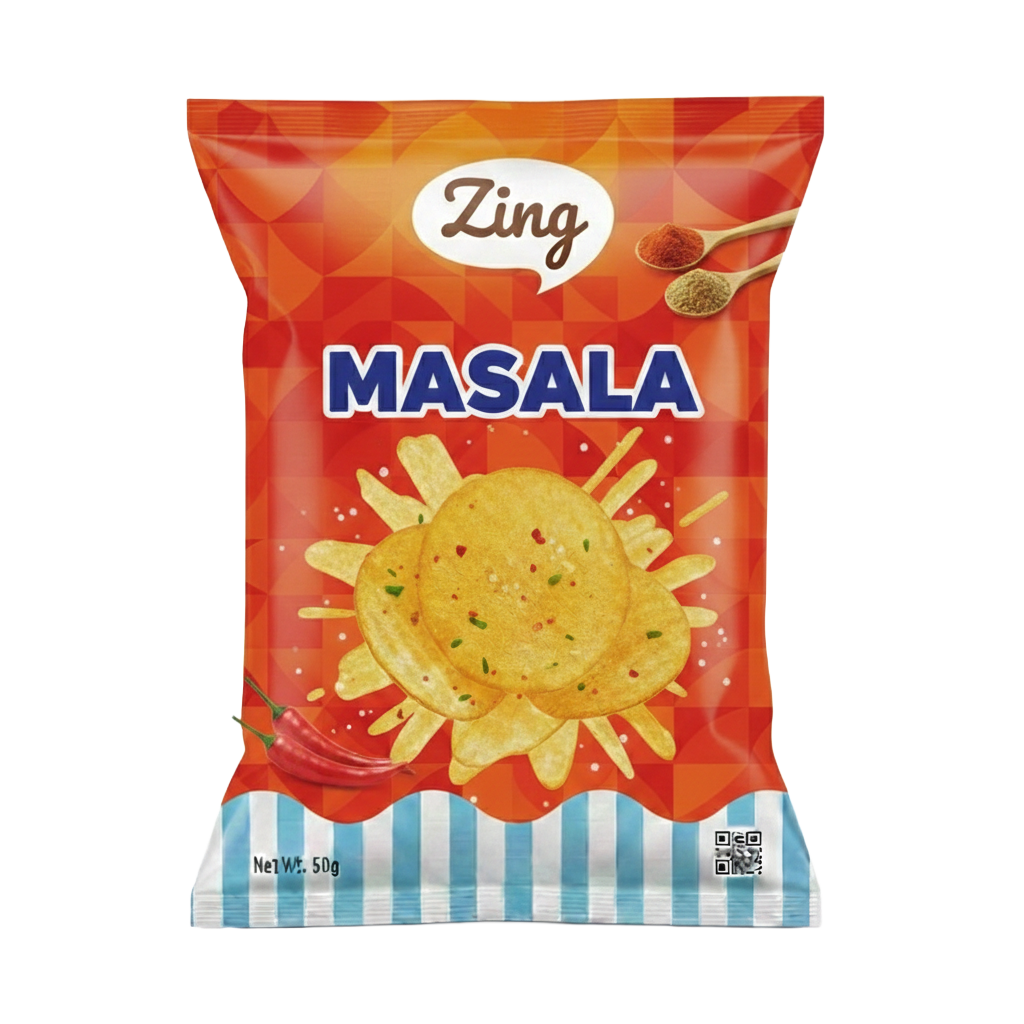
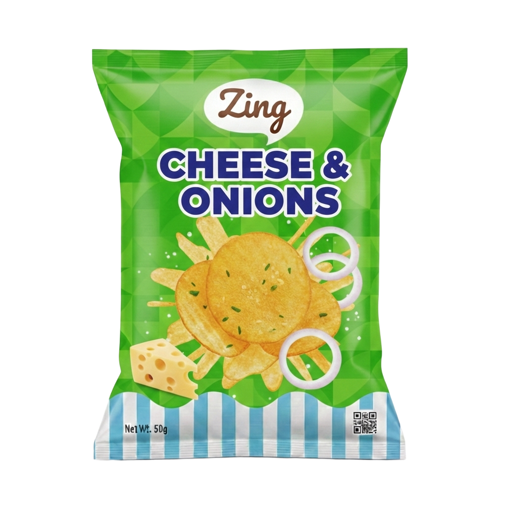
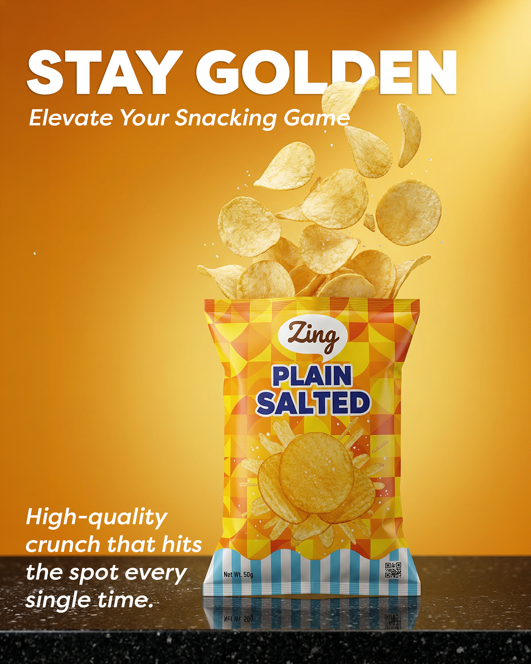
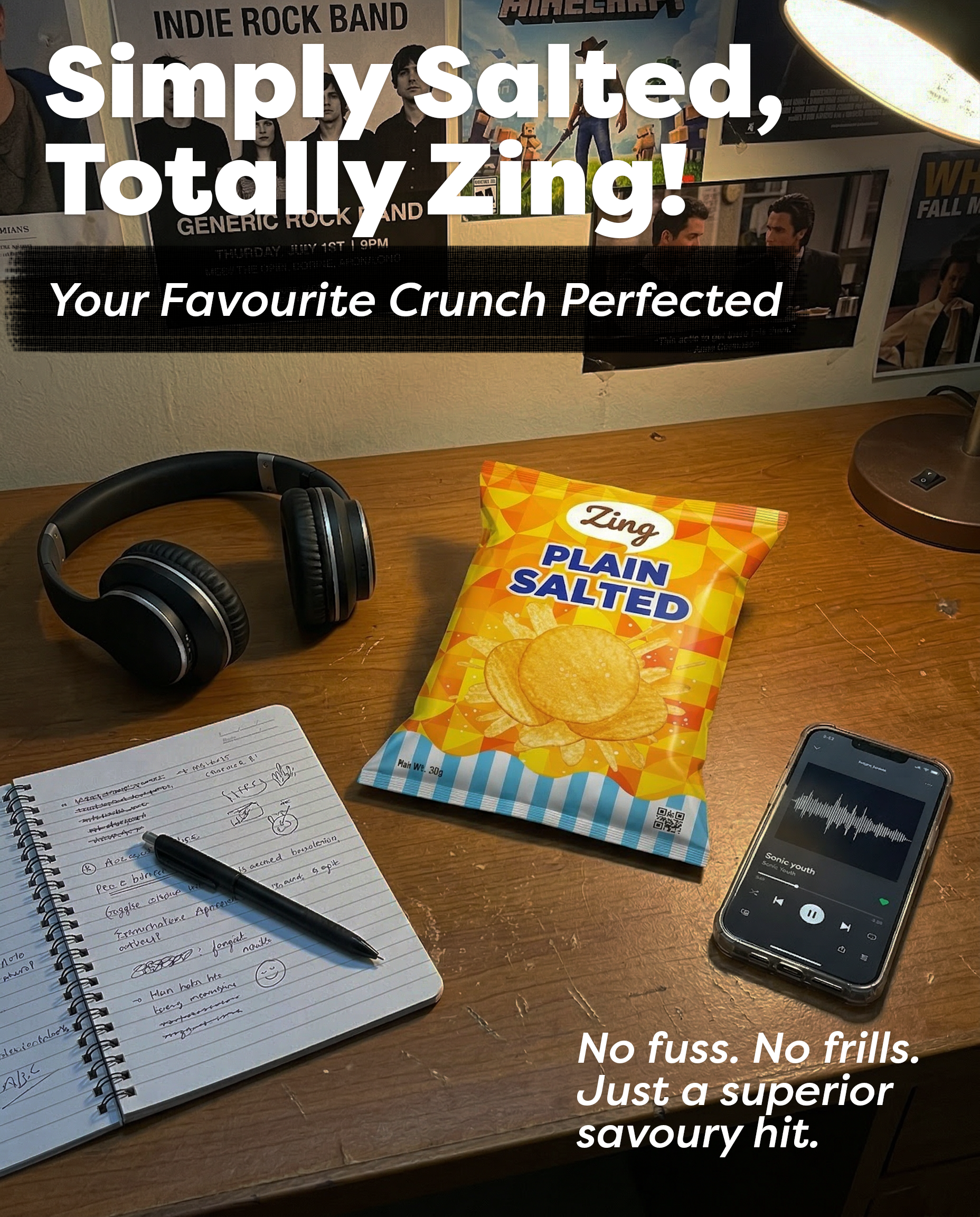
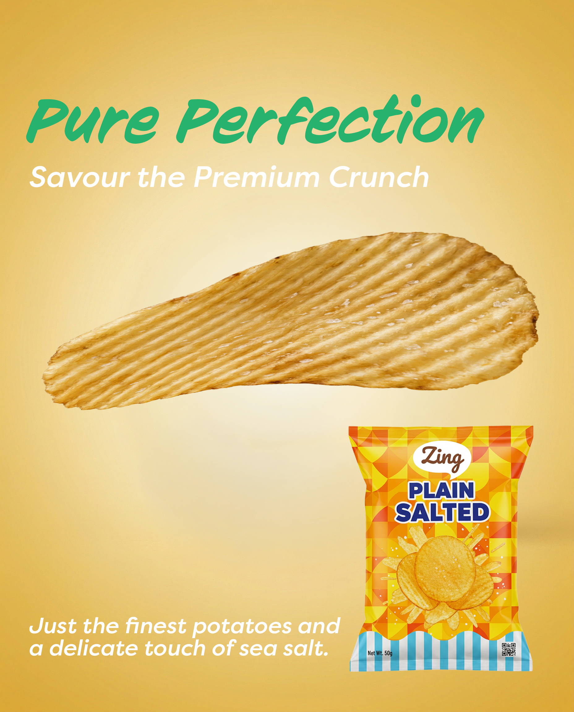
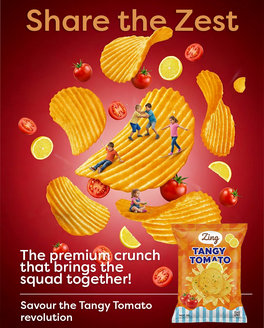
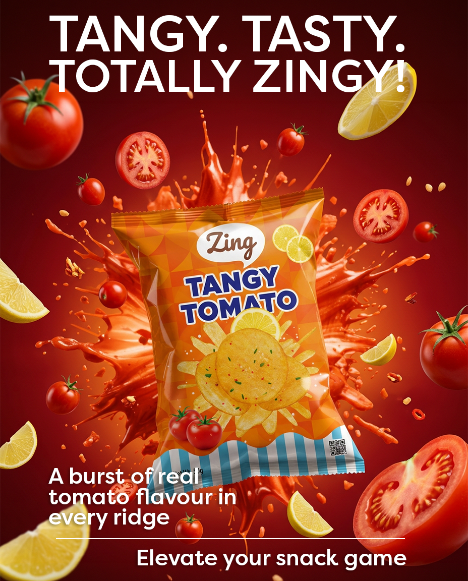
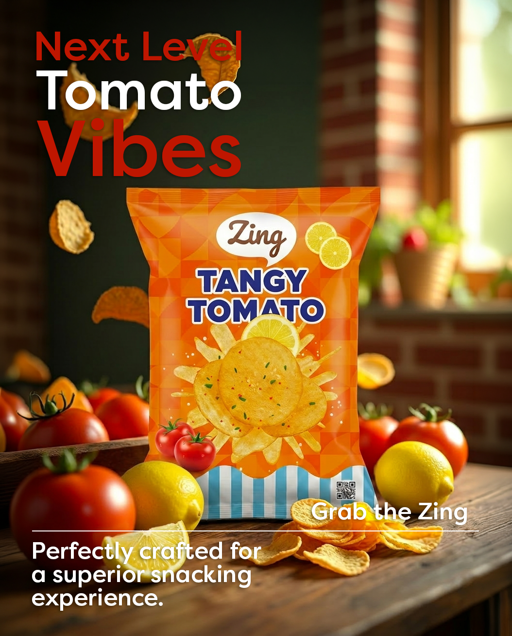
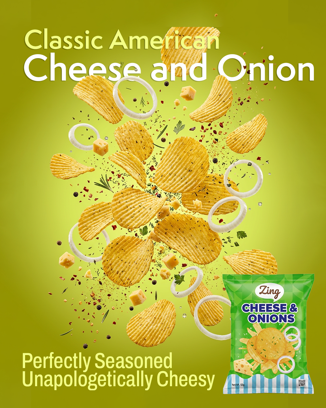
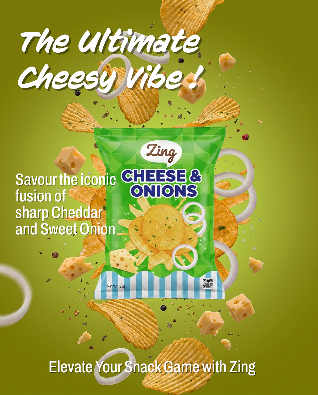
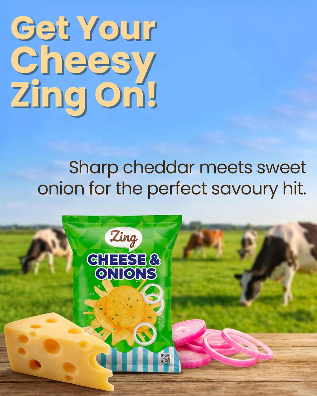
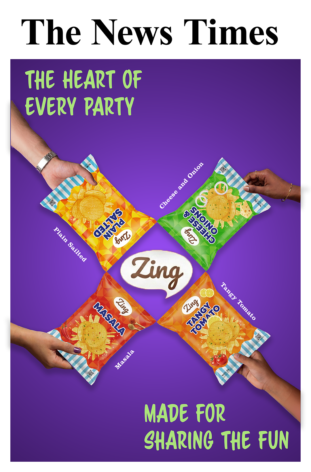
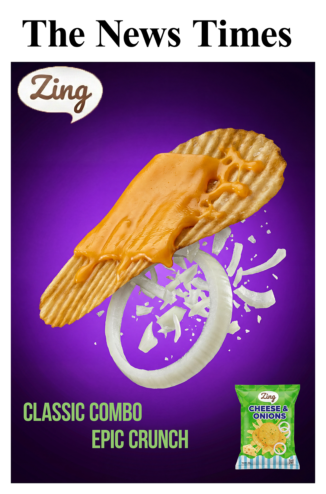
Visual Identity: The logo was provided. To maintain uniformity, we created a “product line” packaging design that is common across all the products. It comprises the logo ‘Zing’ placed in the top third for immediate recognition. Below this is the name of the flavour in bold contrast colours. The colour for the flavour name is maintained across all flavours to maintain a visual link between them. The bottom quarter of the packaging is an interplay of blue and white strips which sit as a contrast to the entire design and binds all the packages across the products. The product image sits in the middle of the package, which is a photorealistic representation of the actual product inside. We designed a complex background of geometric curves in varying shades of the base colour of the flavour to provide a premium feel.
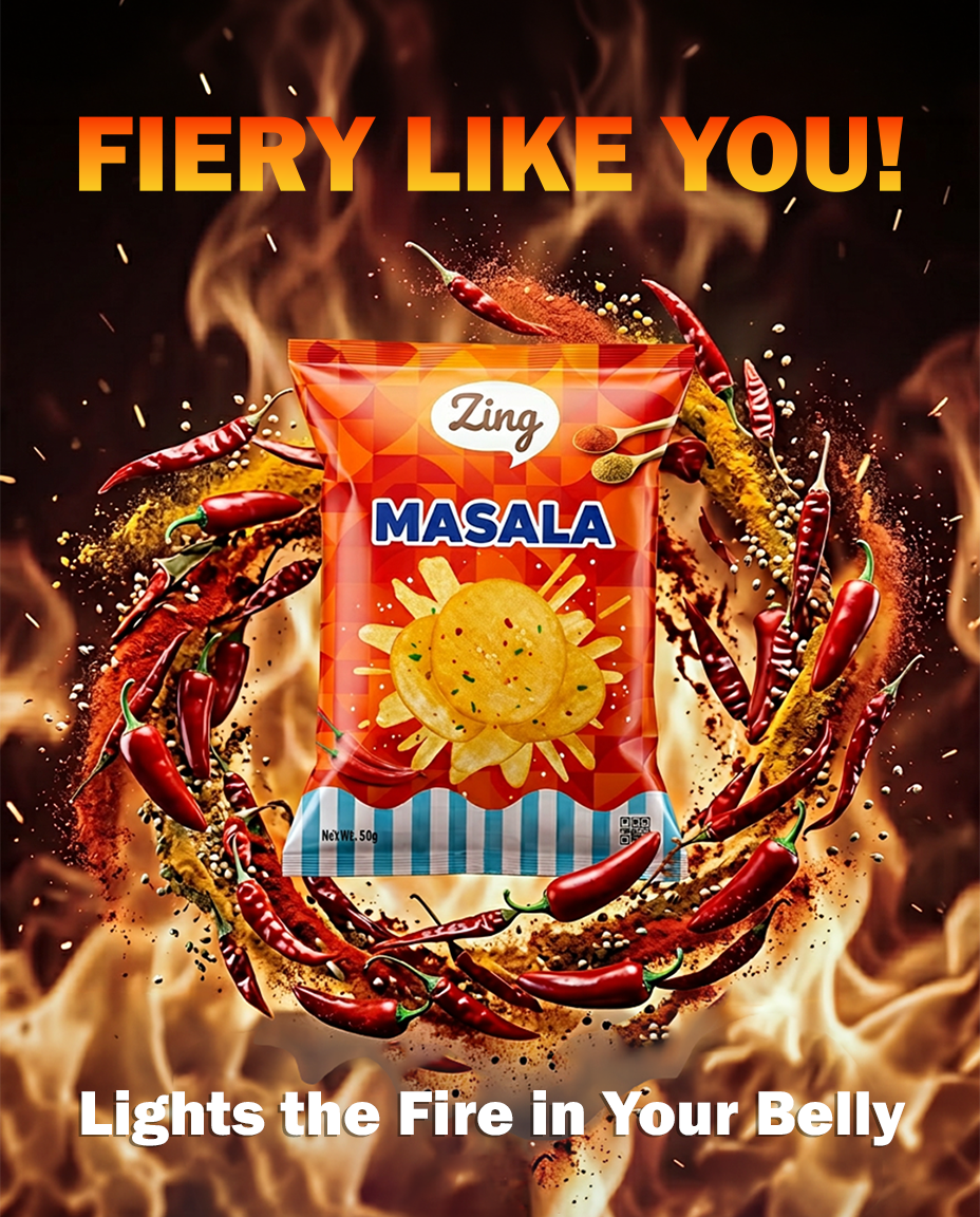
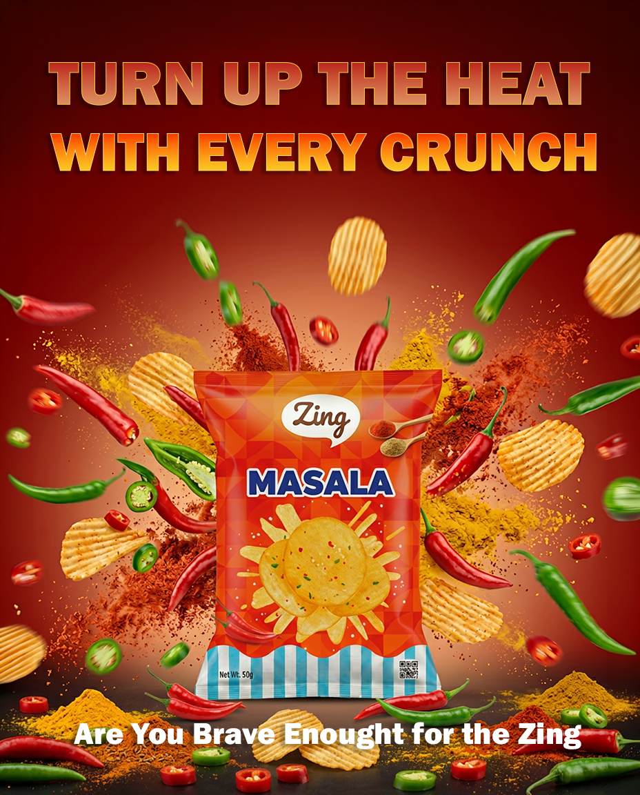
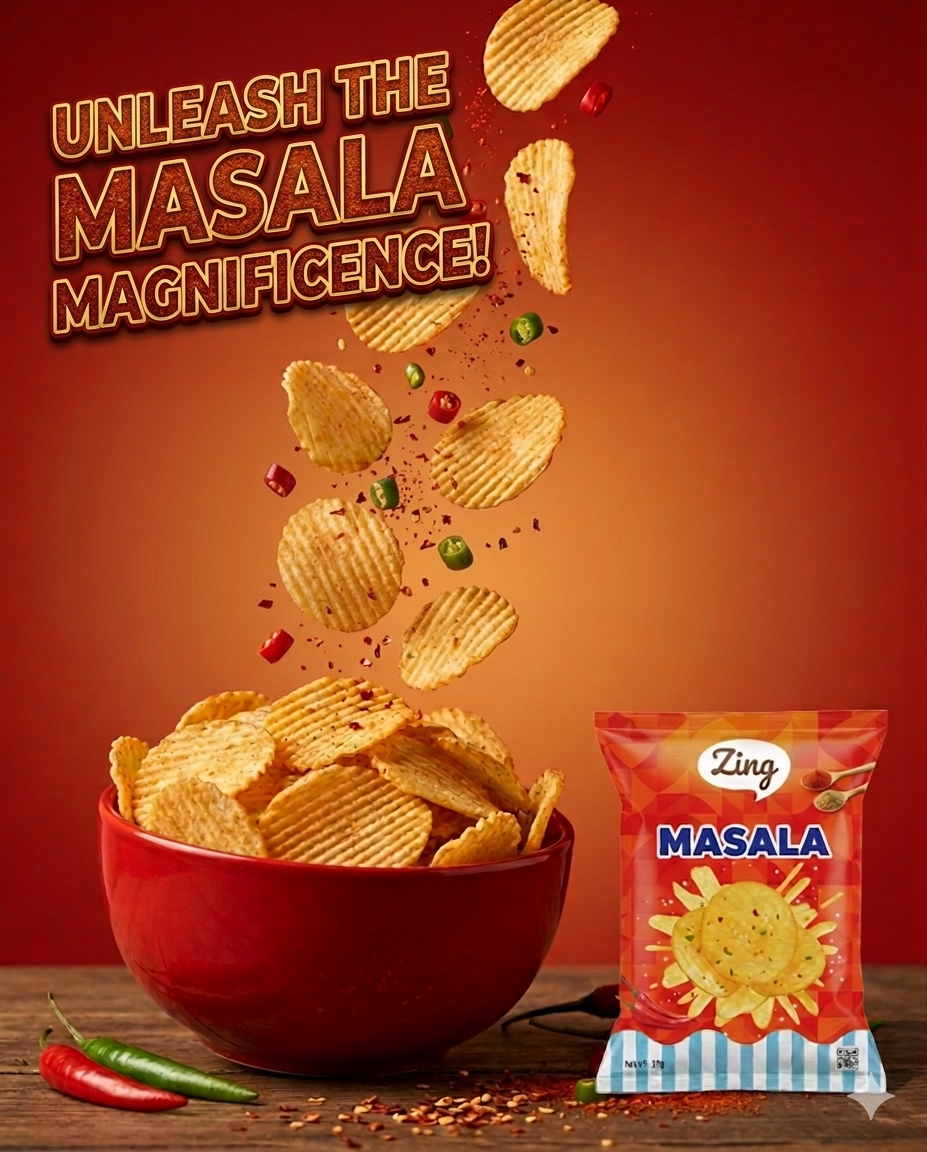
Packaging Details: We used photorealistic representations of the wafers in the middle of the pack. To maintain cognitive continuation, we used Yellow for Plain Salted, Green for Cheese and Onions, Red for Masala, and Orange for Tangy Tomato. Blue and white strips were added at the bottom to bind the entire product line visually.
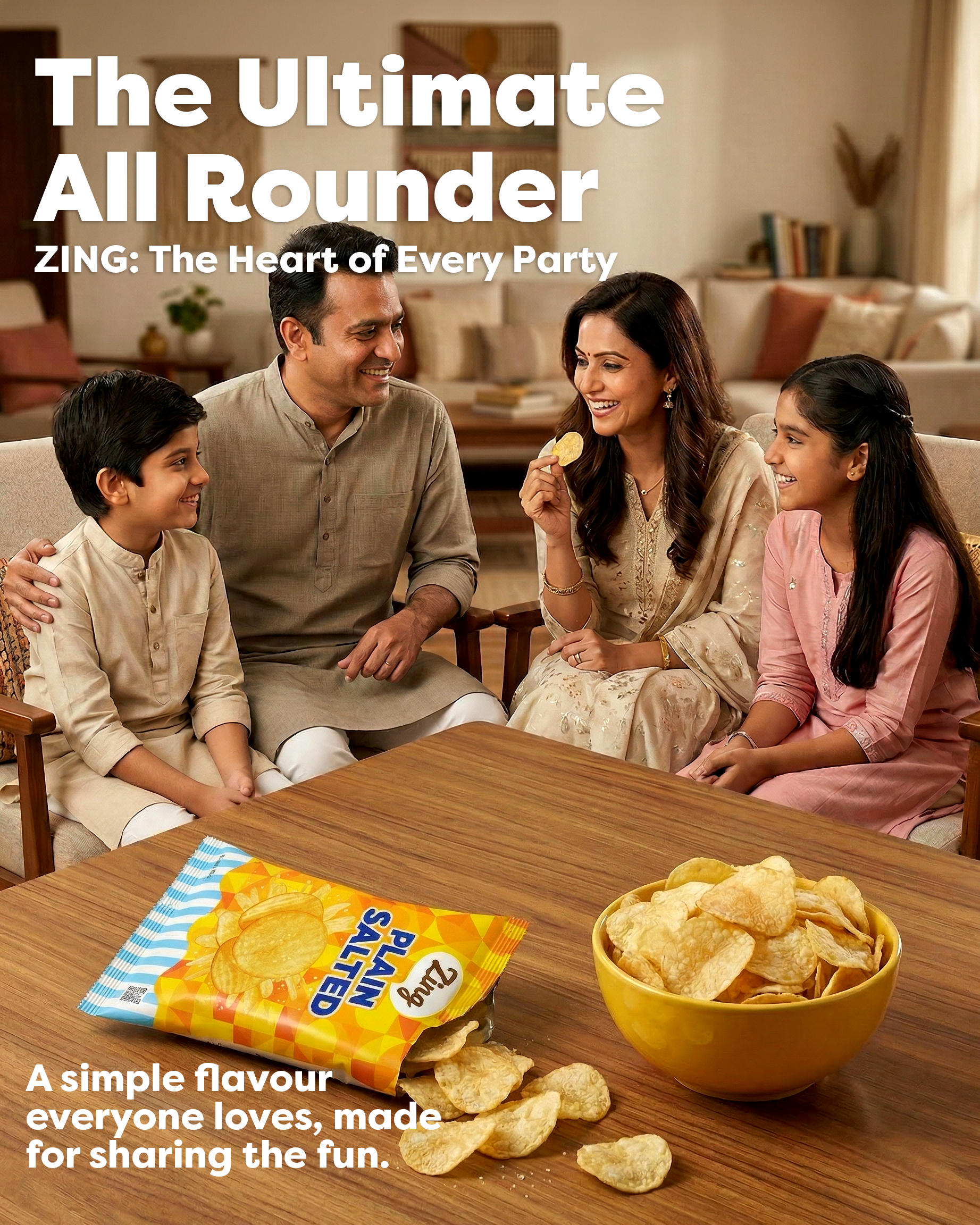
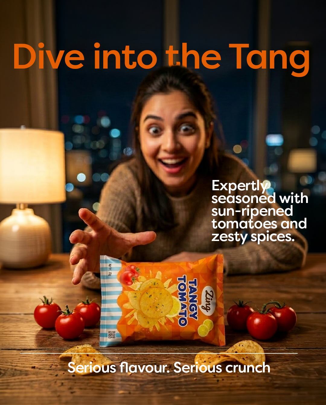
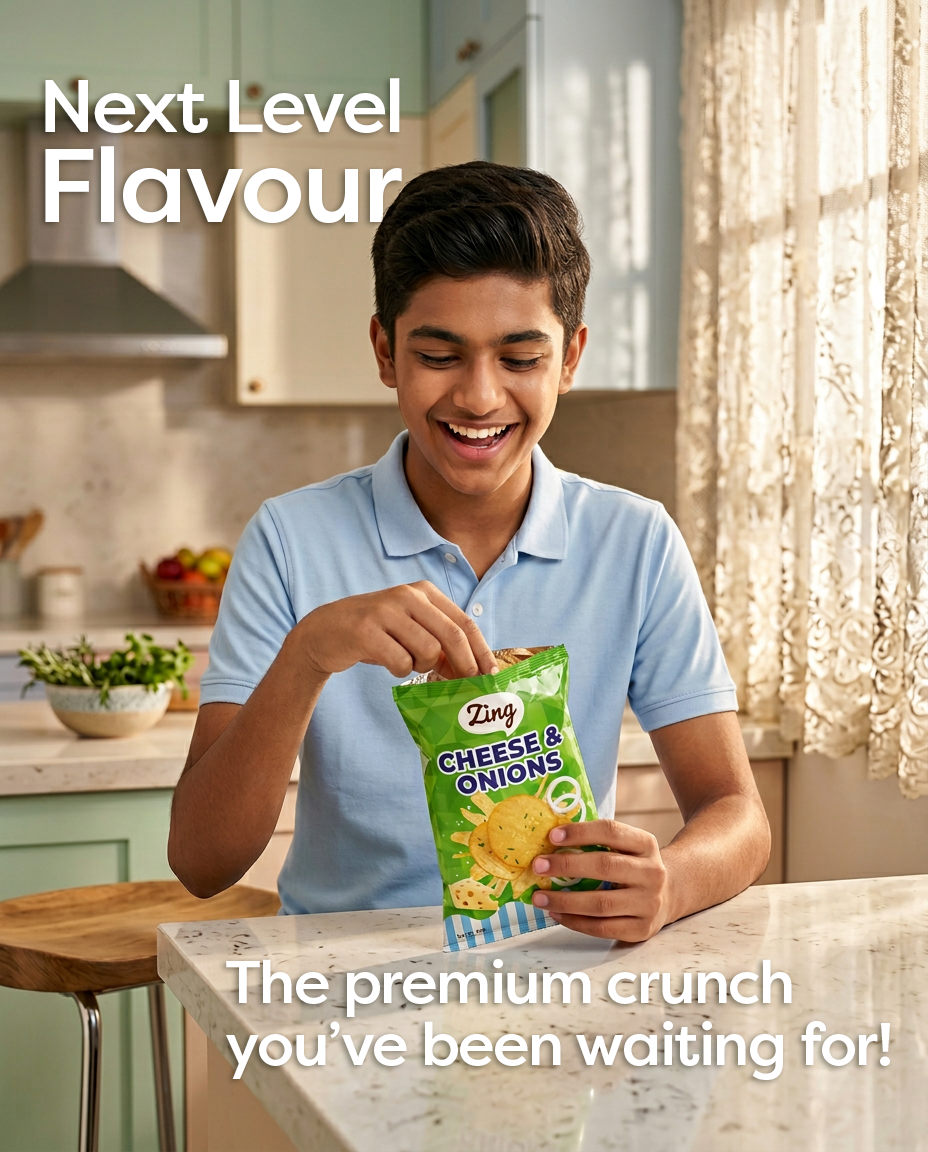
Campaigns: We executed a dual-pronged strategy. The Digital campaign focused on social media to promote individual flavours and real-life situations. The Print campaign utilized newspaper ads to promote the brand family together, showing how the product brings people together.
Packaging Design
Social Media Creatives for Plain Salted
Social Media Creatives for Tangy Tomato
Social Media Creatives for Cheese and Onions
Print Media Creatives Zing Wafers
Social Media Creatives for Masala