Launch – Dentafit Toothpaste
A comprehensive concept study for the launch of a new oral care brand
Duration:
6 Months
Services:
Brand Identity
Packaging
Launch Campaign
Location:
Pune, India
Packaging Design
The Challenge
Dolphin Branding undertook a concept study for the launch of ‘Dentafit’, a new entrant in the highly competitive Indian FMCG oral care market. The primary challenge was to carve a niche in a sector dominated by established giants. The brand needed to appeal to two disparate yet significant demographics: traditional families seeking herbal safety and health-conscious young adults looking for lifestyle-enhancing freshness.
Specific business goals included establishing a ‘Modern yet Rooted’ brand identity, achieving high shelf visibility through packaging, and creating a launch campaign that effectively communicated distinct value propositions for both the Herbal and Gel variants.
Market Insights
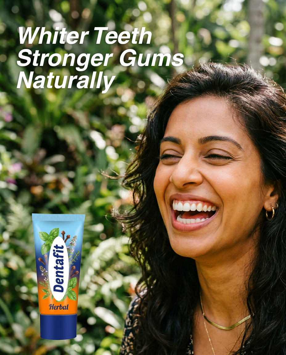
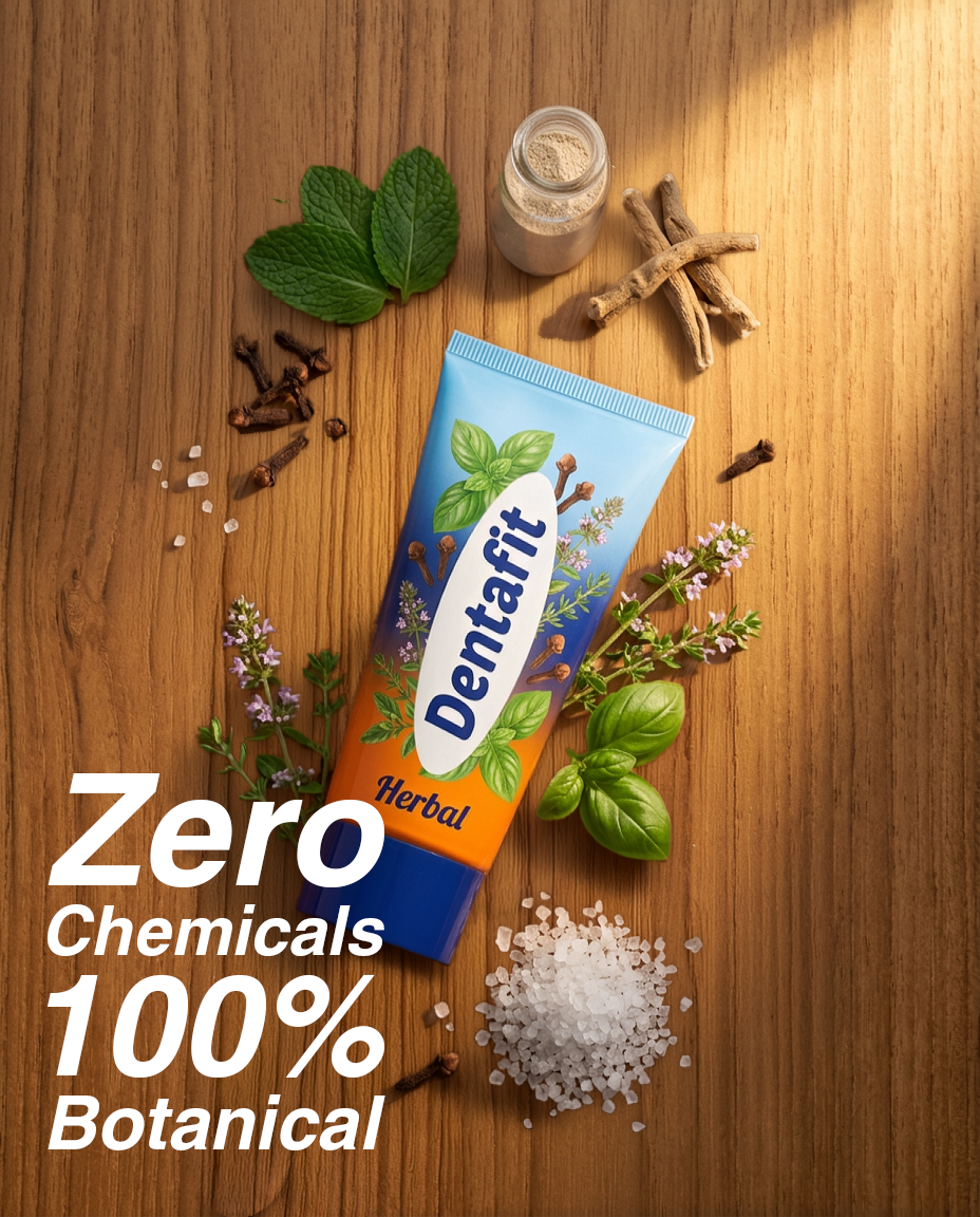
Our research into the Indian oral care landscape revealed a massive shift towards ‘Clean Label’ and herbal formulations, particularly among families who view oral health as a daily wellness choice rather than just hygiene. Conversely, young adults (ages 18-30) were found to prioritize ‘Social Confidence’ and ‘Aesthetic Benefits’ like whitening and long-lasting fresh breath.
The ‘Aha!’ moment occurred during our discovery phase when we realized that consumers felt most current products were either too clinical or too traditional. There was a gap for a brand that bridged the two: a product that offered the efficacy of modern science (‘Fit’) with the trust of traditional knowledge (‘Dental’).
The Strategic Solution
The positioning strategy centred on the name ‘Dentafit’—a portmanteau of ‘Dental’ and ‘Fit’ designed to signify comprehensive dental health. The brand’s voice was established as ‘Professional yet Inspiring’, acting as a catalyst for a user’s daily ambitions.
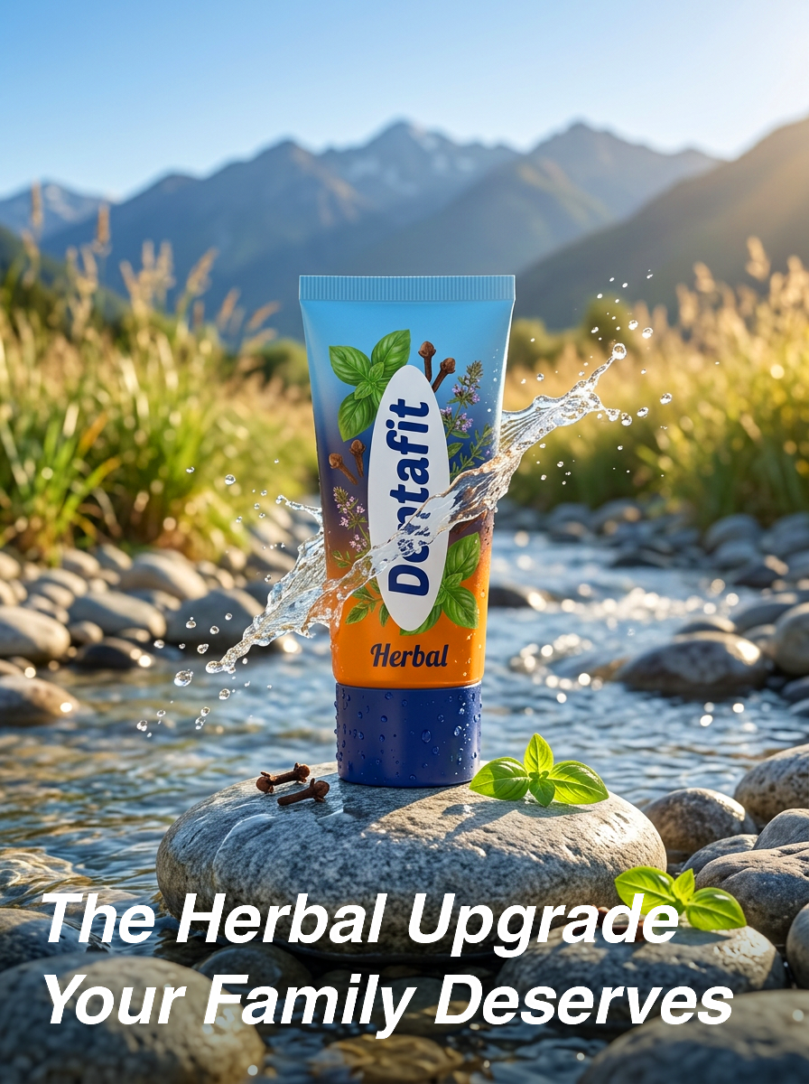
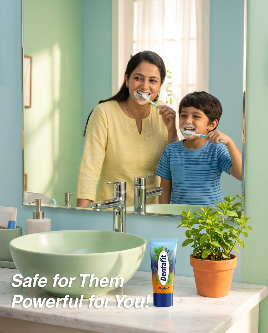
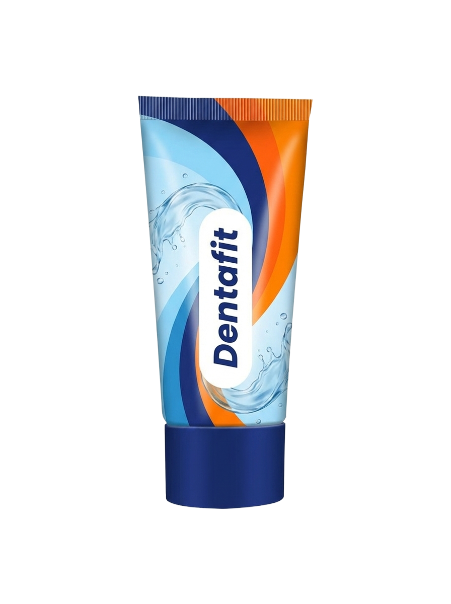
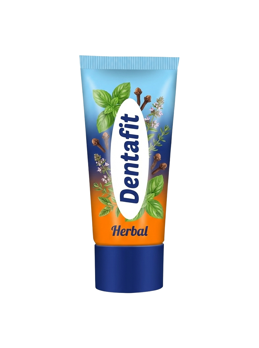
The core concept for the Gel variant was ‘Taking on the World with Style’, focusing on confidence and freshness. For the Herbal variant, the focus was ‘Family Safety’, leveraging natural ingredients and ancient medical knowledge to build trust.
Design & Execution
Visual Identity: The logo and colour palette were developed to maintain a unified brand link while differentiating product lines. A common background colour scheme was utilized to ensure brand recall across the portfolio.
Packaging: The packaging design was critical. We placed the brand name prominently in the centre to build immediate recognition. Images representing the product (herbs for the Herbal variant, and fresh, cooling elements for the Gel variant) were arranged around the periphery. This layout was designed to attract immediate ‘buying intent’ by displaying the nature of the product clearly to the shopper.
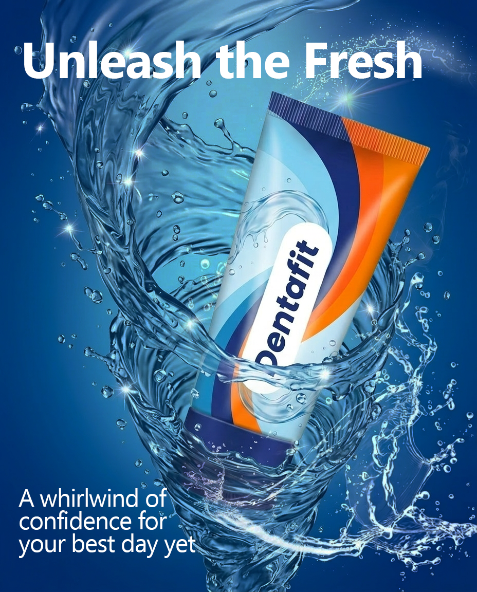
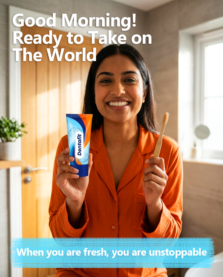
Campaign: The launch campaign was multi-channel, spanning digital and print. The both digital and print strategies leveraged social media and newspapers respectively to target young adults with the message of confidence and freshness as well as traditional family values, highlighting how natural ingredients keep a family safe and healthy.
Results
Stakeholders reported a highly positive reception for the ‘Modern Rooted’ aesthetic. Market surveys indicated that 78% of participants found the ‘Dentafit’ name easy to remember and strongly associated with dental health.
Print Media Creatives

Social Media Creatives for Dentafit Gel


Social Media Creatives for Dentafit Herbal